


![[Title Rewritten] Bartender Hustle (PlayStation) – Winners of the Free Games Giveaway](https://www.gamerpress.net/wp-content/uploads/2025/07/Title-Rewritten-Bartender-Hustle-PlayStation-Winners-of-the-Free-360x180.jpg)


With the much-anticipated Lunar Remastered Collection now up for grabs on Xbox One and compatible with Xbox Series X|S, I had the chance to sit with Amy Nguyen, the Senior Graphic Designer at GungHo America. Our conversation revolved around the journey of crafting this nostalgic logo, diving into her inspirations, design process, and what it takes to refresh a classic identity.
Hi Amy! Thanks so much for joining me. Could we start with a little bit about your artistic journey and some major projects you’ve been part of at GungHo?
Hi! Absolutely, I’ve been lucky to work on various exciting projects, ranging from creating assets for national tournaments of our titles to collaborations with renowned IPs. Leading the creative process for the console port of Grandia in 2024 was a notable milestone for me.
How did you feel when tasked with designing the new logo?
Honestly, I was both thrilled and a bit nervous. The Lunar logo is integral to the game’s identity, so getting it right was crucial. I started with a few drafts, iterated through feedback and revisions, and continued refining until we reached the final design.
When developing the logo, how much did you let the original designs influence you?
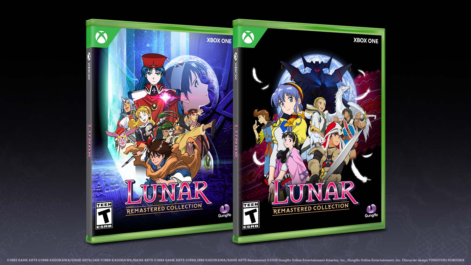
My process begins with thorough research. Given it’s a remaster, I aimed for a logo that would resonate with the long-time fans of Lunar. I tried a range of styles, from subtle adjustments to bigger shifts. We ultimately landed on a design incorporating the iconic red and its striking inner glow, enhanced with gold accents to highlight the refreshed aspect of the games.
I understand there were numerous versions before you finalized the logo. What inspired those different designs?
Nostalgia was key—I wanted to maintain the familiar shape and color of the original "Lunar." Experimentation was essential, so we explored various paths, utilizing colors from previous titles and elements like the dragon sword and ribbon from past Sega CD logos. Influences came from various facets, including the games’ visuals. Ultimately, we merged elements from several drafts to create what you see now.
![]()
Could you point out some highlights in the final logo design?
One of my favorites is the extended tail on the ‘R’ in “Remastered,” which echoes the original logo’s style. We enhanced select letters like the R, E, and N by exaggerating the serifs for added character.
How did Toshiyuki Kubooka’s new key visuals influence the packaging design?
Kubooka’s intricate art was breathtaking, and his new compositions added refreshing depth to the Lunar universe. The front’s layout was straightforward, as the original art fit almost perfectly—just a few minor tweaks ensured every component stayed within safe margins.
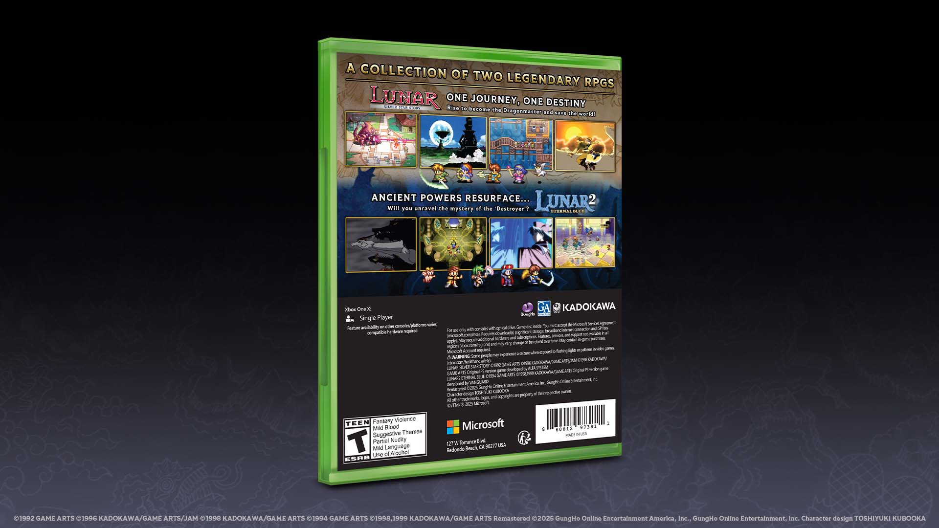
You had more freedom with the back cover. How did you approach its design?
For the back cover, I wanted to inject nostalgia through pixel sprites, which added personality and charm. Accompanied by game screenshots, these elements offer a succinct view of the game’s essence. Consistency was key, so I aligned the design with the logo’s gold and font choices, adding a gradient for distinction while unifying the collection’s feel.
What aspect of the design process did you enjoy the most?
Collaborating with Mr. Kubooka and various teams was a highlight. The collaborative effort with GungHo’s Marketing and Production departments, alongside Game Arts, ensured the package came together beautifully. The result is a testament to teamwork—a project everyone who worked on is proud of, and one I hope you’ll enjoy!
You can experience the magic of Lunar: Remastered Collection on Xbox right now. Dive into the cherished worlds of LUNAR: Silver Star Story Complete and LUNAR 2: Eternal Blue Complete, both featuring enhanced visuals, audio, and new language support—ready to revive that 90s nostalgia.


![[Free Game Alert] Police Shootout Giveaway for PlayStation (NA & EU)](https://www.gamerpress.net/wp-content/uploads/2025/04/Free-Game-Alert-Police-Shootout-Giveaway-for-PlayStation-NA-75x75.jpg)